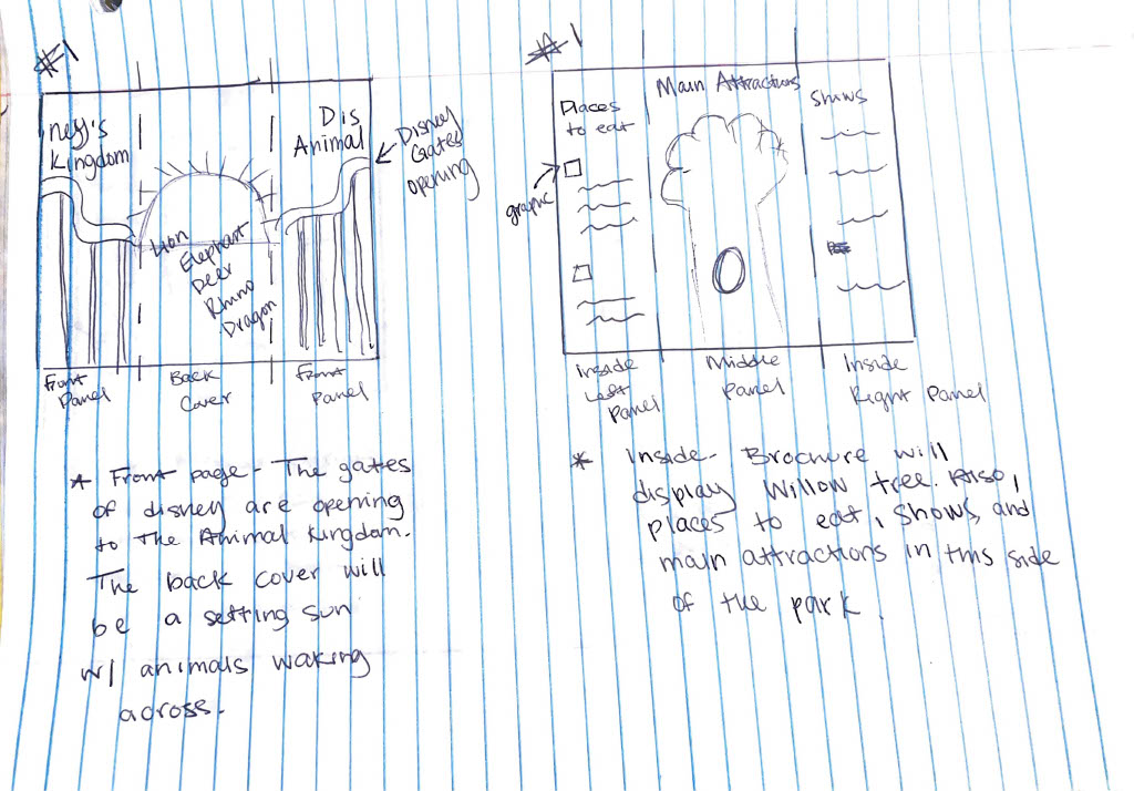
The brochure thumbnails are off to a strong start - having the iconic and recognizable landmarks such as the castle, the tree, and the epcot spaceship earth, is a good idea; it relates all the brochures together by highlighting these.
When doing this layout, pay attention to the order of the panels since it can get confusing on where the content goes. Refer back to the thumbnail pdf outline that I made for students to understand the layout of the panels.
Make sure to not have a lot of body copy, just enough content and information to get the reader to a website. Focus more on the pics and the graphics, with the sparse copy to support.
The cover (see Haley's castle} with the landmarks occupying the full cover is strong for the gatefold. and perhaps on the inside, there can be asymmetrical balance like on Noah's inside #2, where the landmark repeats again, but it is cropped, and coming in from the top.


The brochure thumbnails are off to a strong start - having the iconic and recognizable landmarks such as the castle, the tree, and the epcot spaceship earth, is a good idea; it relates all the brochures together by highlighting these.
ReplyDeleteWhen doing this layout, pay attention to the order of the panels since it can get confusing on where the content goes. Refer back to the thumbnail pdf outline that I made for students to understand the layout of the panels.
Make sure to not have a lot of body copy, just enough content and information to get the reader to a website. Focus more on the pics and the graphics, with the sparse copy to support.
The cover (see Haley's castle} with the landmarks occupying the full cover is strong for the gatefold. and perhaps on the inside, there can be asymmetrical balance like on Noah's inside #2, where the landmark repeats again, but it is cropped, and coming in from the top.